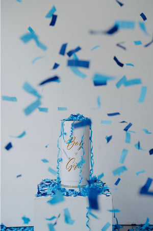
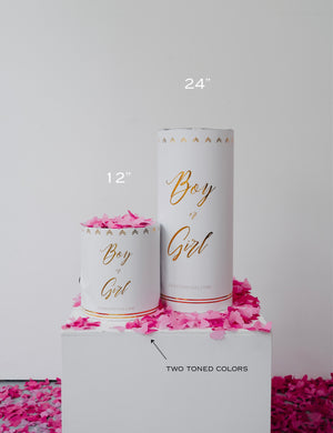


Somewhere between picking the venue and choosing the cake flavor, every gender reveal party lands on the same small but important decision. Pink or blue. It sounds simple, but the color you choose shapes how your photos turn out, how the video looks when you play it back later, and even how the moment feels as it happens. Here is a practical way to think it through.
The Moment Everyone Remembers
Out of everything that happens at a gender reveal, the few seconds when the cannon goes off are the ones people replay over and over. That is why the color choice carries more weight than people expect going in. Pink and blue both do the job of announcing the news instantly, but they create very different moods once the confetti hits the air.
What Pink Looks Like in Real Life
Pink confetti has a soft, warm quality that reads well almost anywhere outdoors. Against grass, blue sky, or a plain wall, it shows up clearly without looking washed out. It also blends nicely into golden hour light, when the sun is low, and everything already has a warm glow to it. Families expecting a girl often lean into this by matching the confetti with pink balloons, ribbons, or outfits, which makes the whole scene feel pulled together in photos.
What Blue Looks Like in Real Life
Blue confetti has more of a cool, sharp look. It stands out especially well against warm tones like sand, wood, or brick, and it holds its color even on an overcast day when there is less natural light to work with. One thing to watch for is shooting blue confetti straight up against a clear blue sky, since the color can blend into the background instead of popping. Angling the shot so the burst lands against trees, a fence, or the ground usually solves this.
A Third Thing to Think About: Confetti Style
Color is only half the decision. The type of confetti inside the cannon changes the look just as much. Metallic confetti catches light and adds a bit of sparkle, which shows up nicely in bright sun or on video. Rice paper confetti has a softer, matte finish and tends to hang in the air a little longer, which looks especially nice if you plan to film in slow motion. Some cannons also mix in streamers for extra movement.
So really, the decision is not just pink or blue. It is pink or blue, paired with metallic or rice paper, paired with your setting and lighting.
A Trick Some Parents Use
If you want to build a little suspense into the moment itself, consider holding one cannon in each color and only pulling the correct one when it is time. One parent holds pink, the other holds blue, and only one gets used. This adds a beat of tension to the video and often makes for a more genuine, unscripted reaction since even the people holding the cannons do not know which one will fire.
Match the Color to Your Backdrop
Before you commit to a color, walk through where you will actually be standing. Look at what is behind you. Grass, house siding, a fence, a pool- whatever it is will either help your confetti stand out or blend in. A quick walk through your party space with this in mind can save you from a photo where the color gets lost against the background.
There Is No Wrong Answer
Pink and blue both deliver the same result in the end: a burst of color that tells your story in one unforgettable second. The right choice comes down to your setting, your lighting, and the kind of look you are going for, whether that is soft and dreamy or bright and sharp. Shakin Reveal offers both colors across different sizes and confetti styles, so you can match the cannon to the moment you are picturing.
0 comments